Creating a new Brand for an iconic Adirondack destination
Background
_______
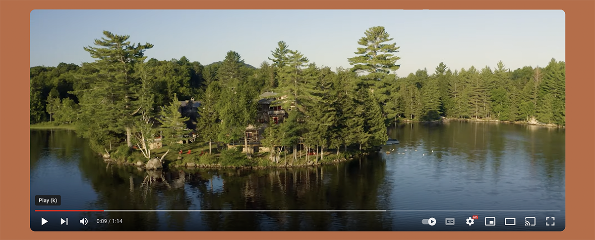
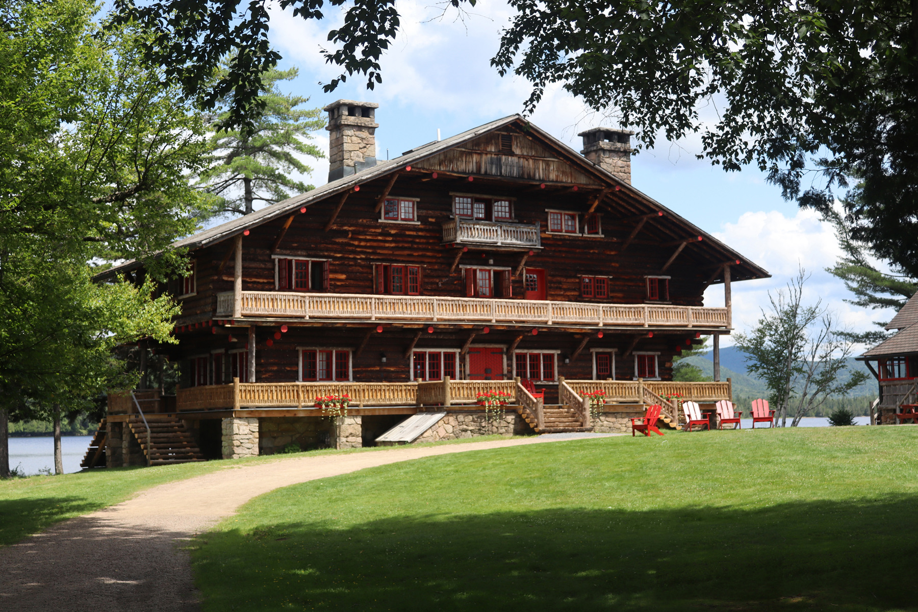
Great Camp Sagamore is a 125 year-old National Historic Landmark near Raquette Lake in the central Adirondack Mountains. This non-profit institution provides a variety of educational programs, historic tours, live music events, and vacation getaways for thousands of guests each summer.
ver time, their marketing messages had become complex and confusing. Crafting A Brand was hired in 2019 to help the organization evaluate and refine the messages they used to market their products and services, and to create a new visual identity.
Simple Title
Logo
_______
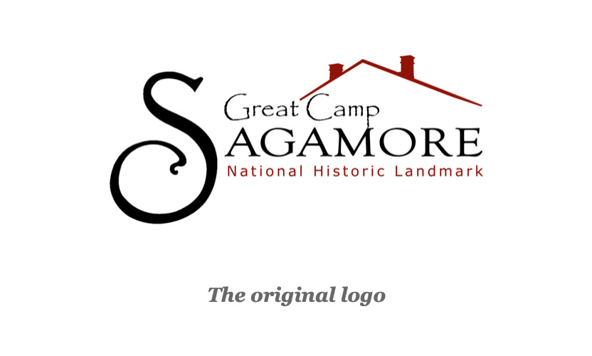
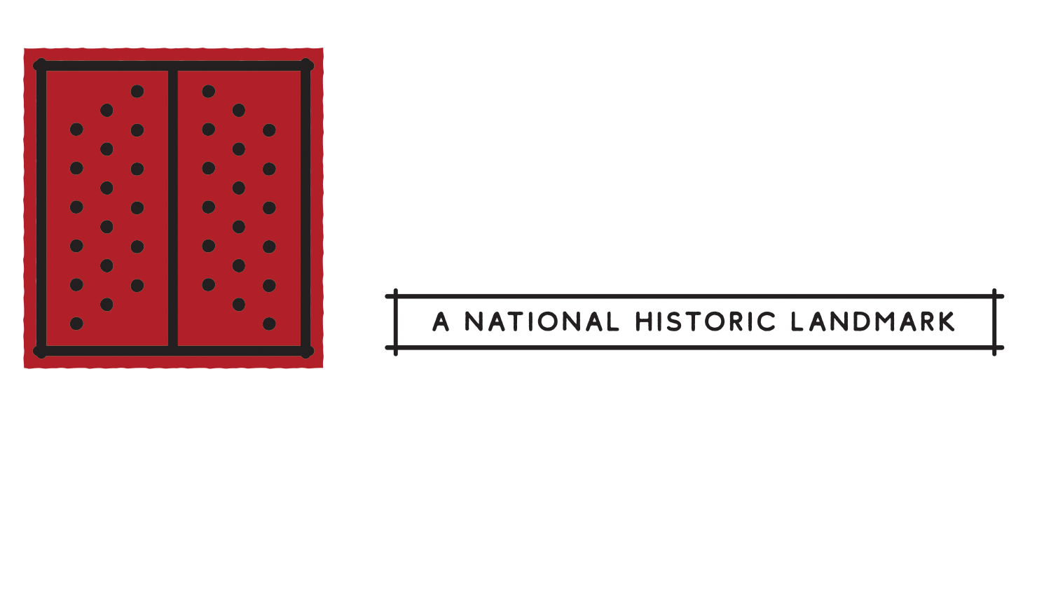
The original logo had been in use for years, and over time it had morphed into a hodgepodge of typefaces, a roofline, and a large letter S. It was visually cluttered, difficult to scale, and not representative of the stature endowed upon Great Camp Sagamore when it was named a National Historic Landmark.
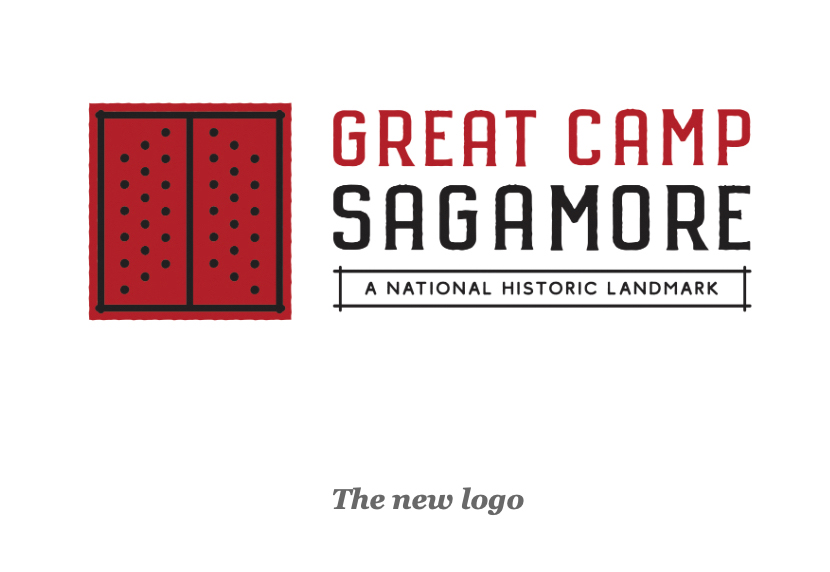
The new logo is anchored by an architectural element that symbolizes the essence of Great Camp Sagamore: the iconic red doors that greet visitors at the main entrance of the majestic Main Lodge. The condensed typeface is sturdy and legible, and evocative of the early 20th-century design floursihes found throughout Camp. The doors, words, and tagline align to form a simple horizontal unit that's easily reproduced across a wide variety of signage, marketing collateral and merchandise.
The Messaging Dilemma
_______
What is Great Camp Sagamore?
It's many different things, to many different audiences. So many, in fact, that it presents a dilemma to the marketer: It's a lodge for overnight getaways, a place to take in Adirondack history and tours, a hiking and paddling destination, a retreat for multi-day arts and educational programs, a lunch or dinner destination, and a summer concert venue.
Without an easy-to-understand messaging strategy, the diverse array of choices—each of which appeals to a different audience—had become a liability. The wide-ranging menu of experiences needed to be simplified in order to market them effectively.
A streamlined messaging platform
We created two unique messaging devices that appear at the front end of most of our marketing efforts. When used as headlines, they quickly establish that:
1) Great Camp Sagamore is open and welcoming to the public (not private or exclusive)
2) I can visit for a few hours, or, I can stay for an overnight
3) It's easy to understand what I'll do when I get there
Messaging Platform #1

Audiences at the top of the marketing funnel (who have never heard of Great Camp Sagamore) have fundamental questions about exactly what it is. This messaging platform begins to answer that question, as it suggests “it's easy to visit Great Camp Sagamore. I can pop in for a few hours on a day trip, or I can book a room and stay for an Adirondack getaway.”
Messaging Platform #2
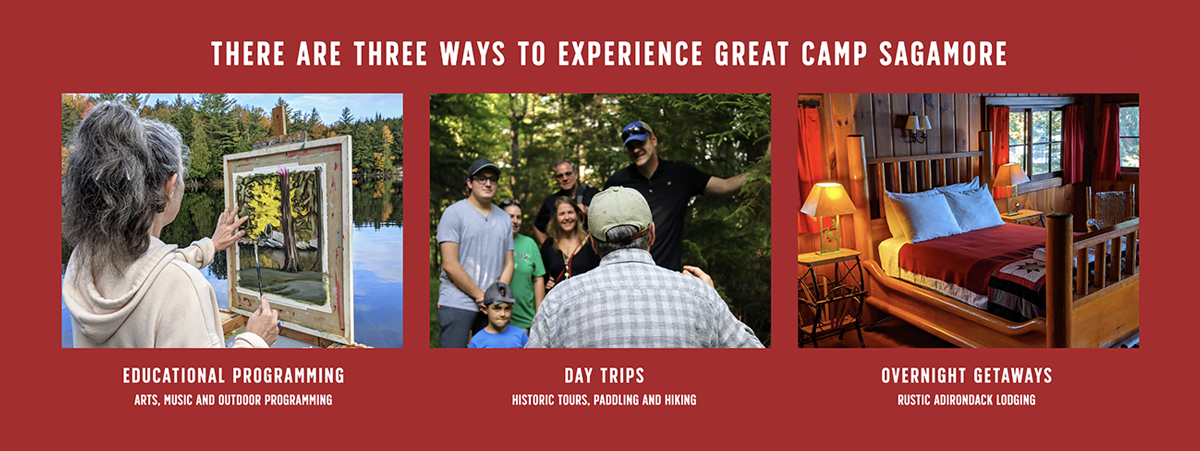
Once the visitor understands that the Sagamore experience can be as simple as a three-hour commitment, we explain what you'll do when you get there. This easy-to-read messaging platform (shown here on the website) simplifies the extensive array of visitor opportunities by placing them in one of three categories: Educational Programming, Day Trips or Overnight Getaways.
These two platforms are used throughout Sagamore’s marketing channels, greatly enhancing our ability to describe the destination in a simple and efficient fashion.
Bringing the Brand to Life
_______
Photography
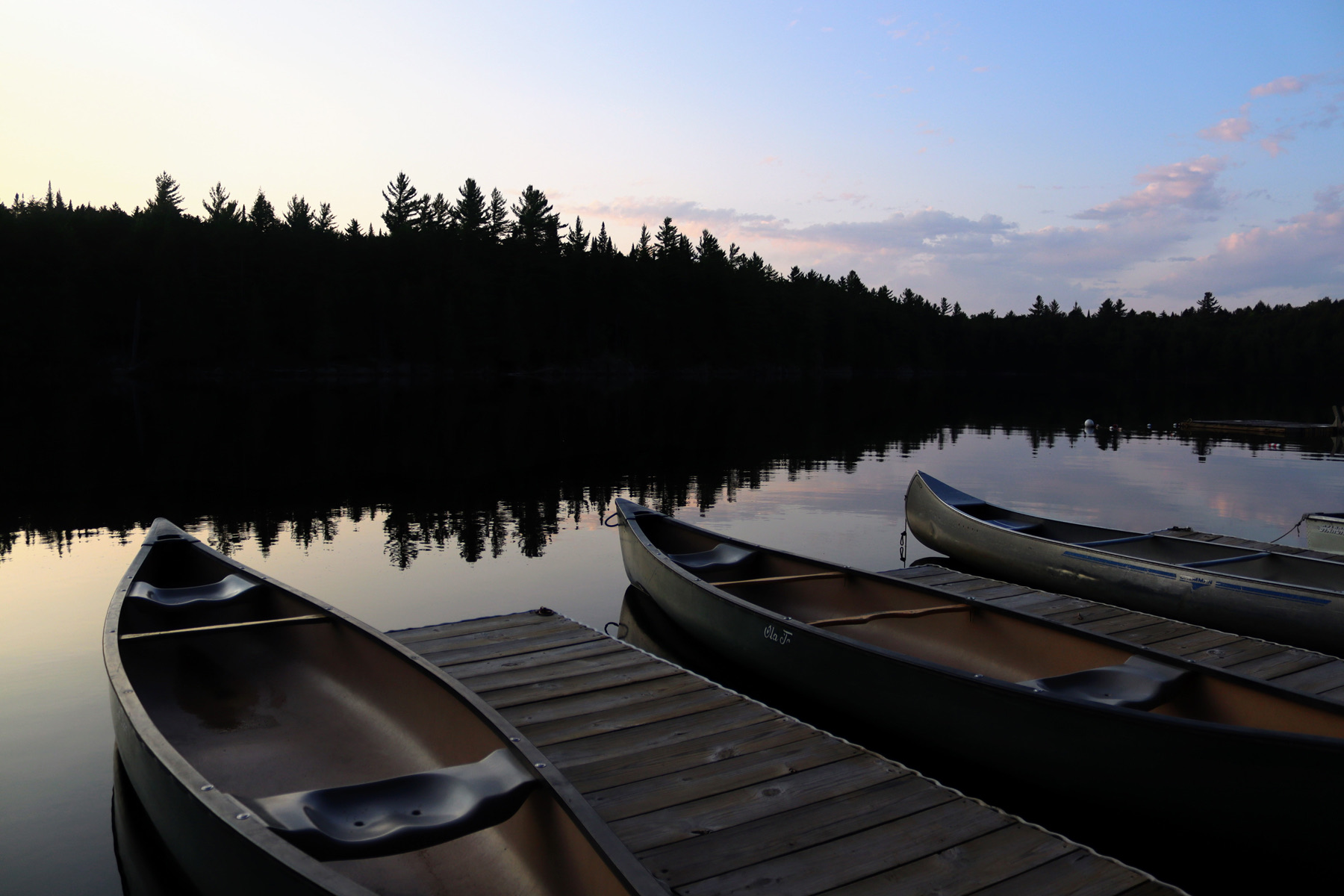
Travelers want to see pictures of the places they're going to visit—and better yet, photographs of people enjoying themselves in those settings. Crafting A Brand has built an image library over the course of four summers that features hundreds of images of guests at Camp. These images drive all of our marketing and communications efforts, and are a cornerstone of the visual brand.


Sales Collateral and Advertising
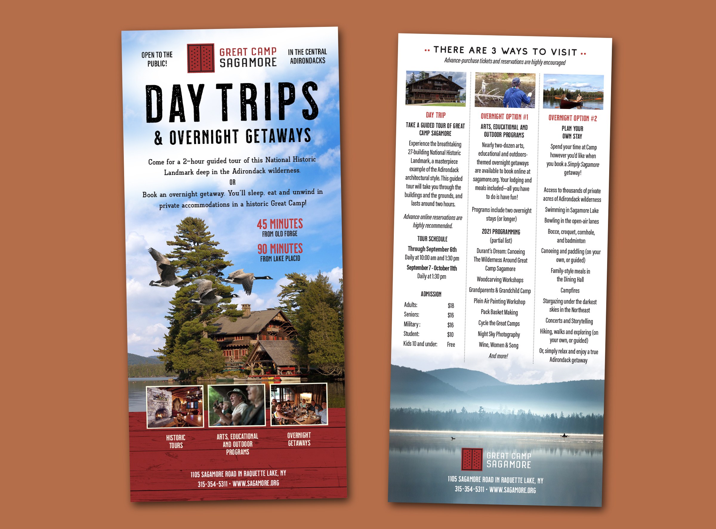
Rack Cards
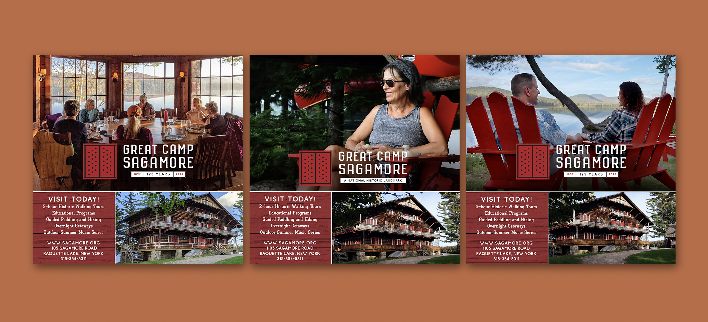
Small-space Print Ads
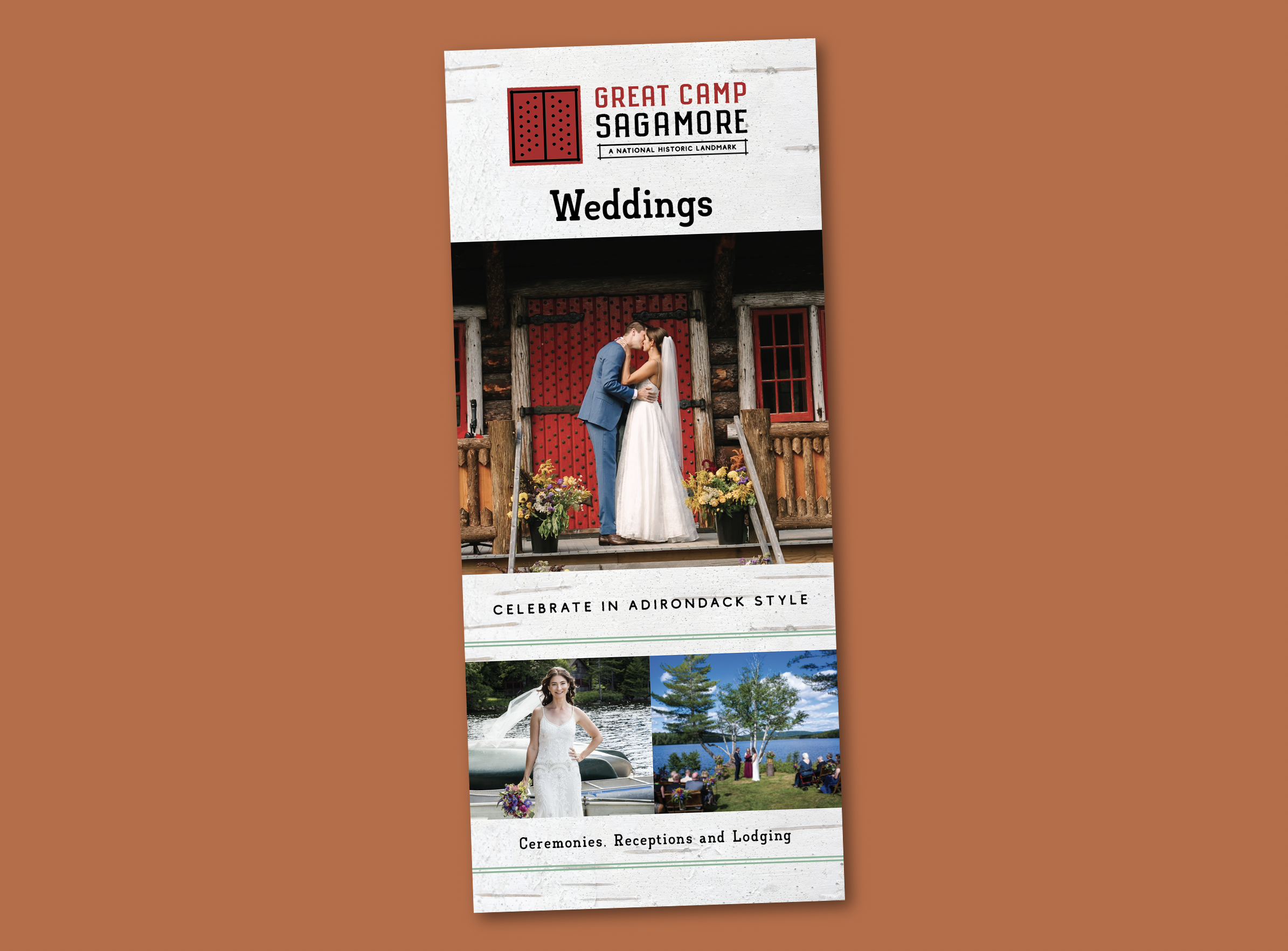
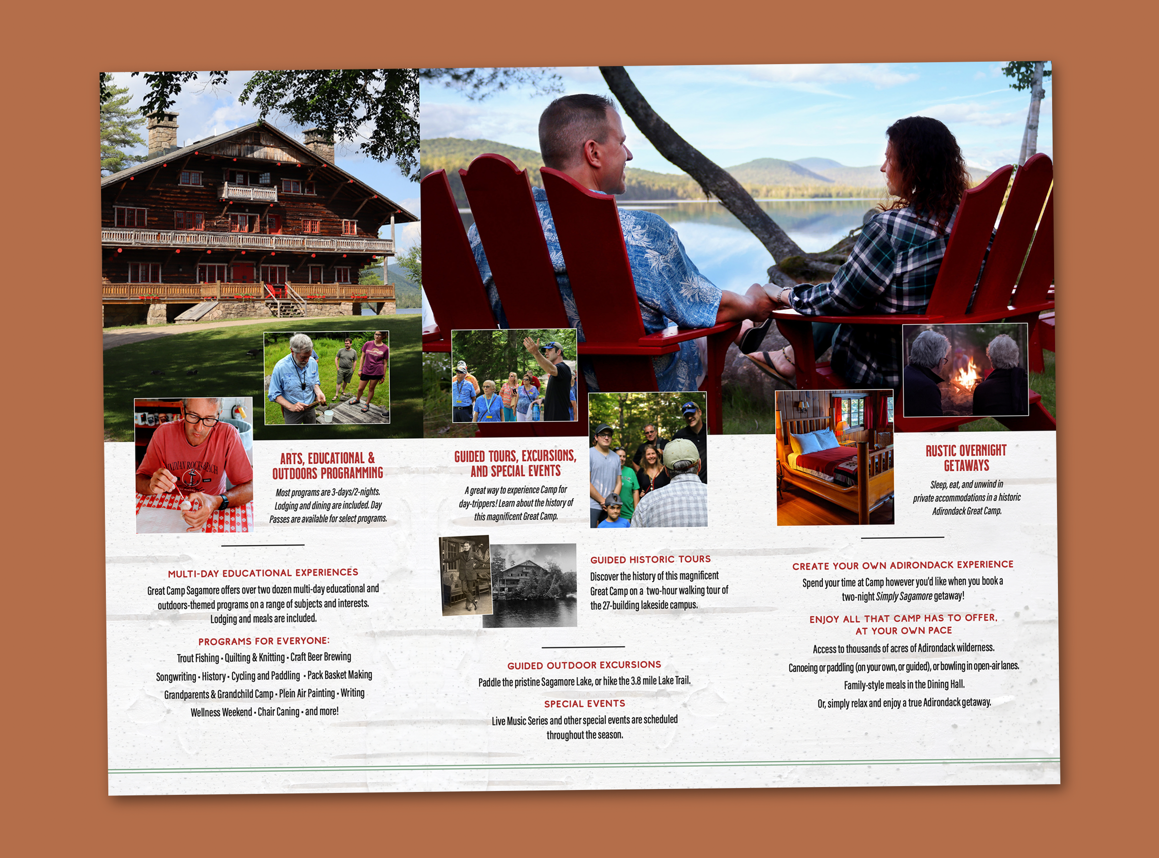
Brochures
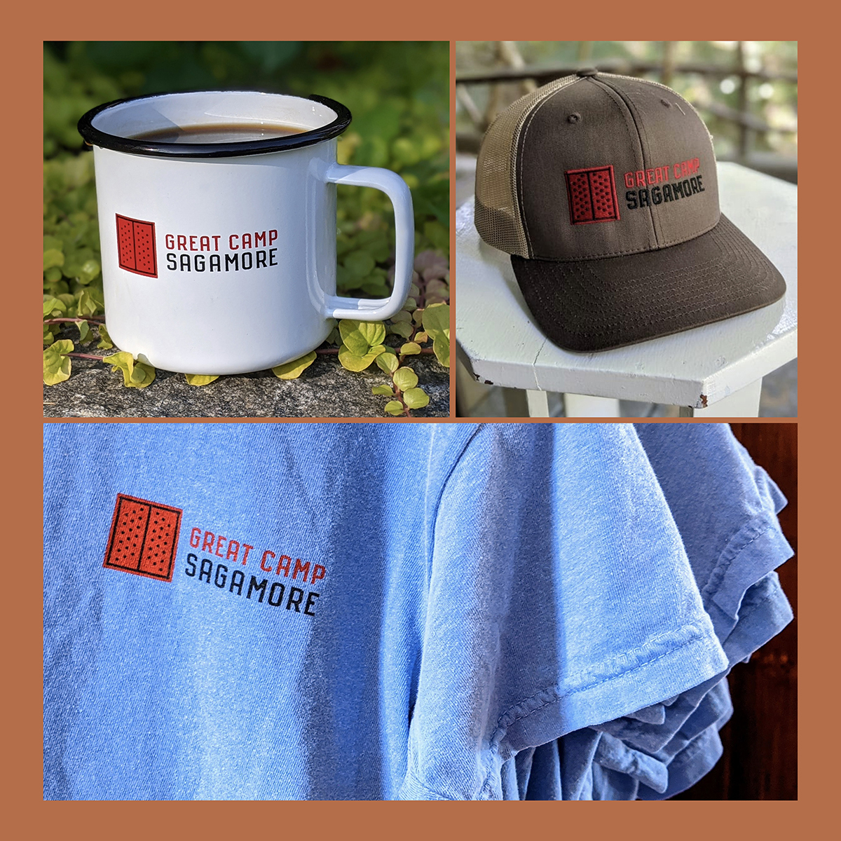
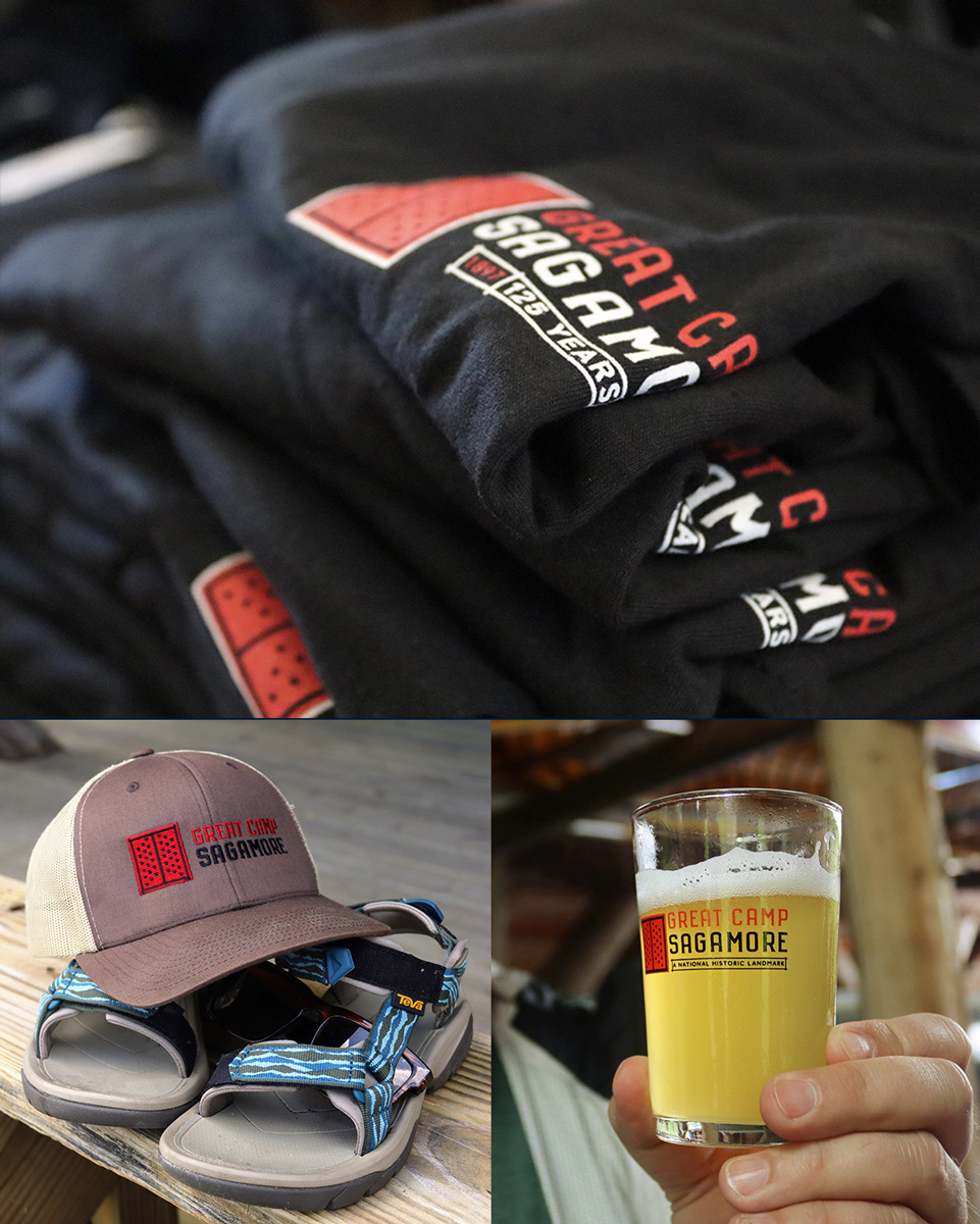
Merchandise
